Capacity Development for Regional Cooperation and Integration
ABOUT MI
Corporate design
This page contains all relevant corporate design of Mekong Institute.
The use of the Corporate Design is mandatory for all media produced by the organization to ensure that the organization presents a unified, recognizable and professional image.
Should you have any questions, please write to: [email protected]
Logo
Font & Color Code
PPT Template
Logo
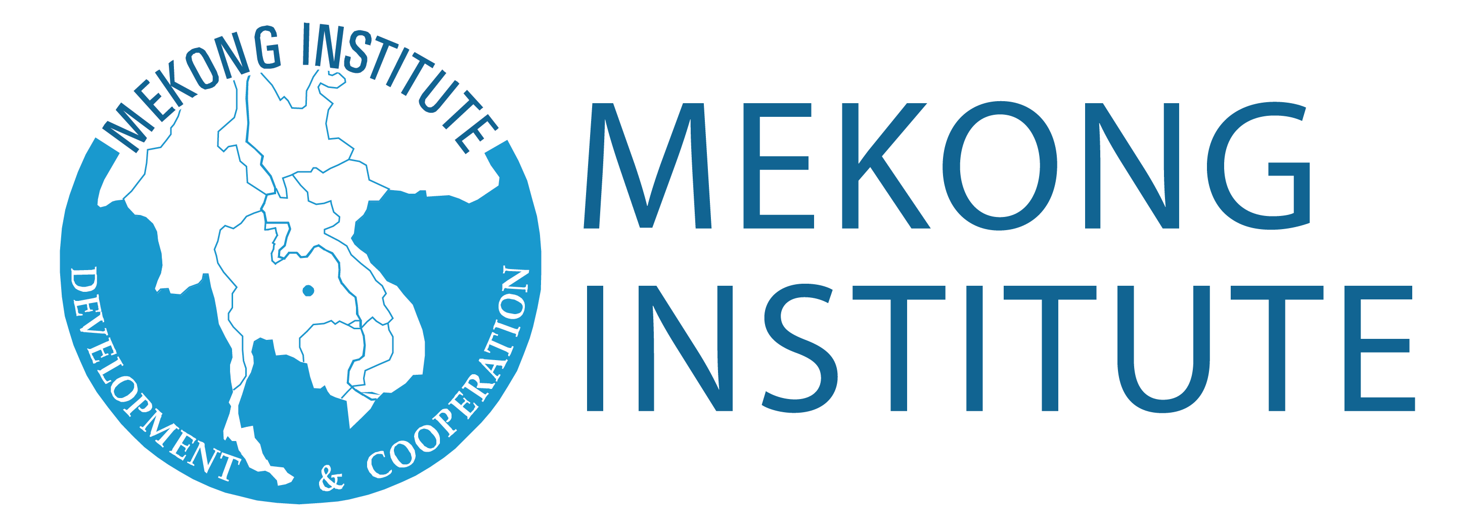
The new MI logo has been designed to convey a sense of change and modernization in the Greater Mekong Subregion (GMS) and reflect the new direction of MI.
The MI logo consists of two parts:
 When the MI logo appears on a dark background, such as black and dark blue background, the negative version shall be used to make the MI logo more visible.
 The MI logo should not be displayed on patterned backgrounds or used over images.
- The GMS map on the left
- The full name of MI on the right
 When the MI logo appears on a dark background, such as black and dark blue background, the negative version shall be used to make the MI logo more visible.
 The MI logo should not be displayed on patterned backgrounds or used over images.
Font & Color Code
MI has five corporate fonts for use depending on the media, relevance or desired effect:
- Avenir
- Tenorite
- Arial
- Lato
- Quicksand
MI’s main color is the blue (#00A6DE) used in the MI logo. Other standard colors are as shown below:
PPT Template
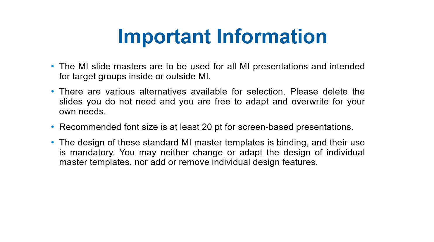
The MI slide masters are to be used for all MI presentations and intended for target groups inside or outside MI. There are various alternatives available for selection. Please delete the slides you do not need and you are free to adapt and overwrite for your own needs.
Recommended font size is at least 20 pt for screen-based presentations.
The design of these standard MI master templates is binding, and their use is mandatory.
